HBO Max Responsive Navigation (2022)
I was the primary architect and lead designer for the updated navigation to support our responsive mobile and web clients. I did most of the UX design and led efforts for visual design, motion design, and accessibility. Our goals were to update our navigation to be simple, responsive, and well-suited to the device the user was on. We created a navigation system that shared most primary components across phone, tablet and desktop with a few strategic variations to make the most of the capabilities of the different platforms.

Project in a Nutshell
My Role:
Lead Designer. I was responsible for end-to-end UX and architecture and coordinated all research, ideation, visual design, and prototyping activities.
Customer Impact:
Provided quick access to genres for customers, satisfying a loud an frequently cited need for our users
Responsive layouts greaty improved the experience for xs to xl screens
Designed a11y-first so navigation was available to screenreader users and keyboard only users for the first time
Most Fun:
The complexity. This project touched all sections of the app and needed to work well for a wide array of page-types (collection, search, settings, etc.), across 7 breakpoints on all mobile and web devices, and support a dozen languages, all while looking beautiful and engaging. I loved digging into these details and working closely with design systems, engineering, product, and other designers to get the details just right.
Biggest Challenge:
The complexity. This project required careful mapping of responsive behavior, backstack behavior, animations and transitions, and a multitude of states of headers, menus and bottom navs for all of our regions and subscription types.
What I’d Do Differently:
I would have created visuals for the backstack earlier in the process. I created very thorough documentation of the backstack rules, but the images and flows really helped solidify the team’s understanding of what pages and states (scrolling, search results, etc.) should be added to the backstack and how the menu should behave as users moved through the app.
Early Explorations
In the earliest days of the project we did a massive competitive analysis of navigation patterns across streaming services and beyond. From these we proposed 3 initial approaches that would fit within our scope, while providing clear improvements over our in-market experience.
Chosen Direction
After many more iterations and explorations, we landed on the approach we would ultimately deliver. It built off of our existing navigational structure, while also elevating key features and simplifying our browse menu. Once this decision was reached we began pushing on the designs to make sure they would work across languages, at different breakpoints, and meet accessibility needs.
Interaction, Visuals, Motion, and Accessibility
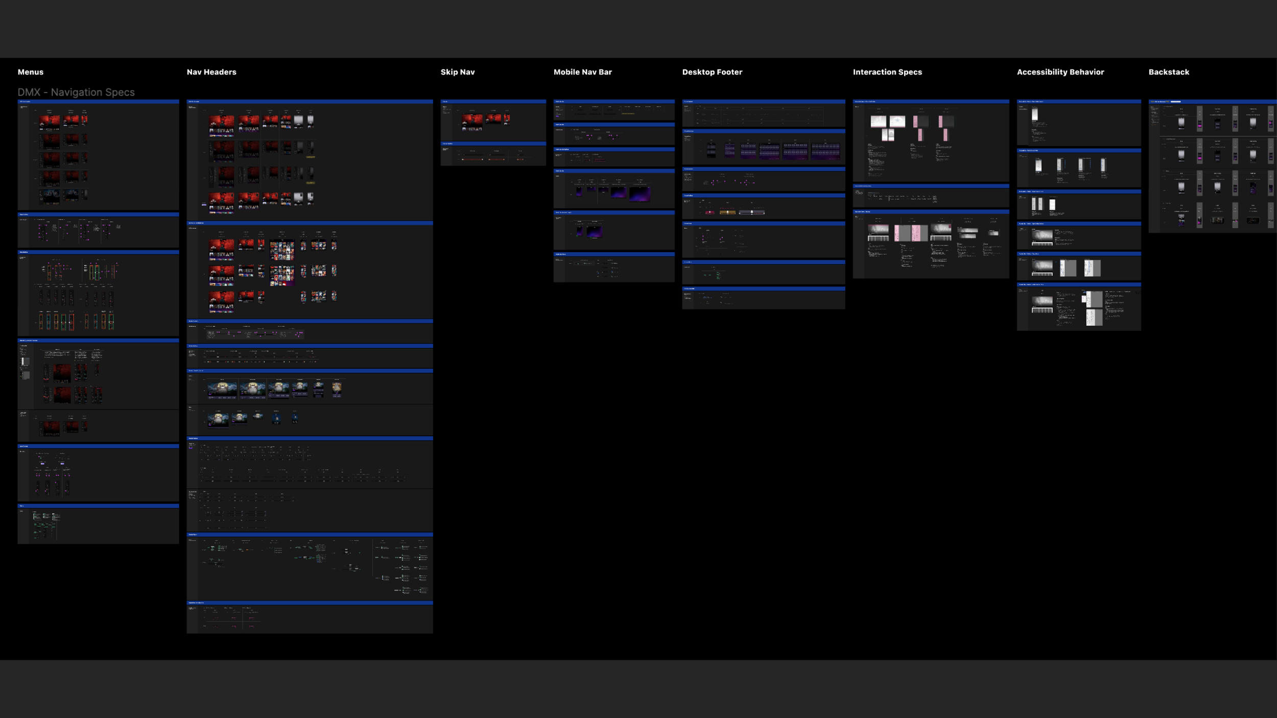
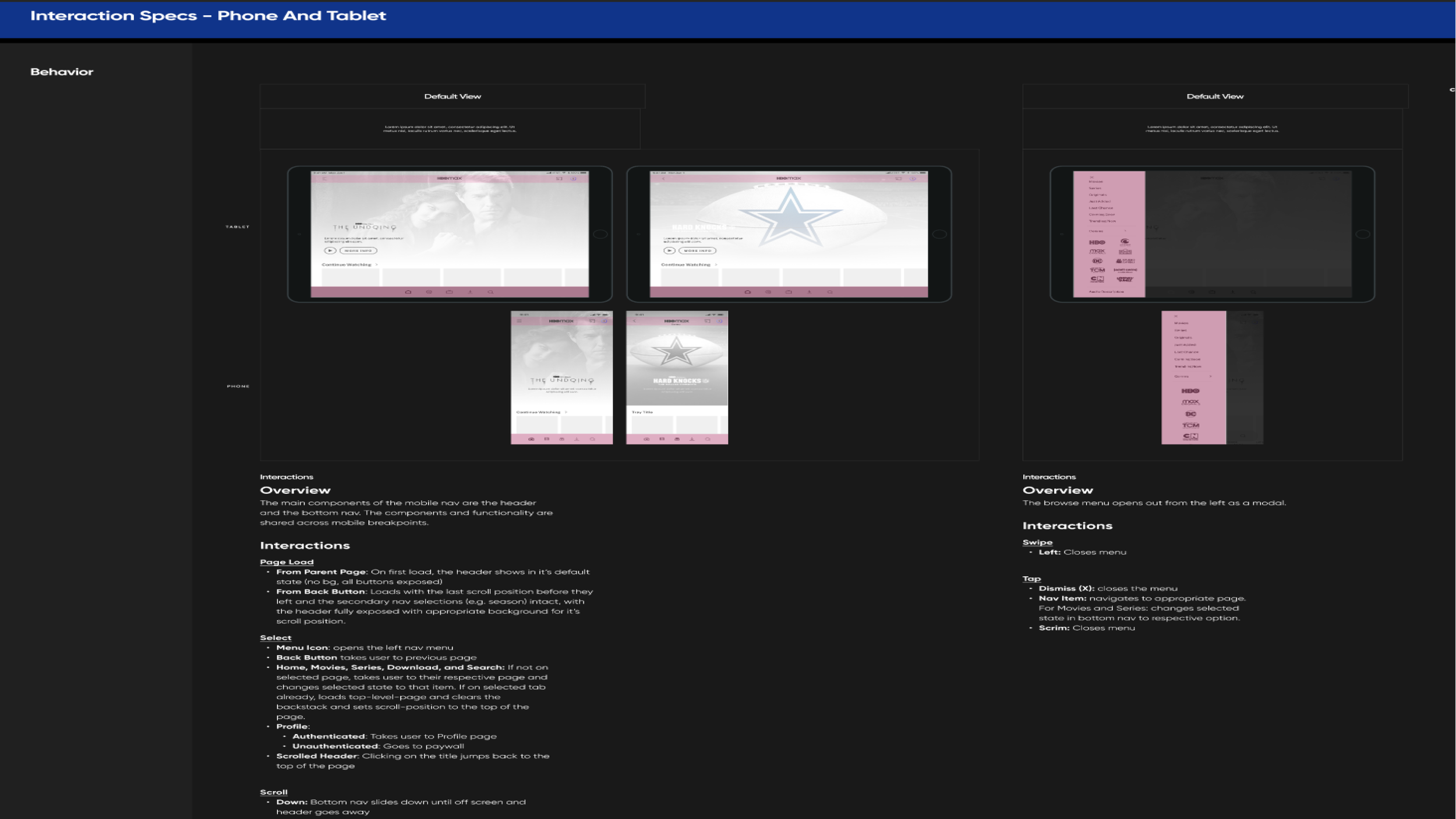
Once we had the overall direction decided and tested, it was time to work out the details. I led a team of designers in concert with our cross-disciplinary partners to capture the interaction design, visual design, motion, responsive behavior, and accessibility needs for a navigation system that would support 7 breakpoints on desktop and 5 on mobile. We created annotated wireframes, specs, redlines, and prototypes. We worked tightly with our design system to create new components and styles that would be needed for this work. Our spec was among the biggest our team had ever created, and ultimately served to support the work of three development teams who implemented the designs to great success.


